Studying Early Decision Making with Progressive Bar Charts


Published at
VIS
| Oklahoma City, USA
2022
Abstract
We conduct a user study to quantify and compare user performance for a value
comparison task using four bar chart designs, where the bars show the mean
values of data loaded progressively and updated every second (progressive bar
charts). Progressive visualization divides different stages of the visualization
pipeline—data loading, processing, and visualization—into iterative animated
steps to limit the latency when loading large amounts of data. An animated
visualization appearing quickly, unfolding, and getting more accurate with time,
enables users to make early decisions. However, intermediate mean estimates are
computed only on partial data and may not have time to converge to the true
means, potentially misleading users and resulting in incorrect decisions. To
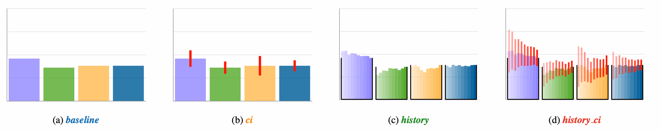
address this issue, we propose two new designs visualizing the history of values
in progressive bar charts, in addition to the use of confidence intervals. We
comparatively study four progressive bar chart designs: with/without confidence
intervals, and using near-history representation with/without confidence
intervals, on three realistic data distributions. We evaluate user performance
based on the percentage of correct answers (accuracy), response time, and user
confidence. Our results show that, overall, users can make early and accurate
decisions with 92% accuracy using only 18% of the data, regardless of the
design. We find that our proposed bar chart design with only near-history is
comparable to bar charts with only confidence intervals in performance, and the
qualitative feedback we received indicates a preference for designs with
history.