Design Patterns and Trade-Offs in Responsive Visualization for Communication


Published at
EuroVis
2021
Abstract
Increased access to mobile devices motivates the need to design communicative
visualizations that are responsive to varying screen sizes. However, relatively
little design guidance or tooling is currently available to authors. We
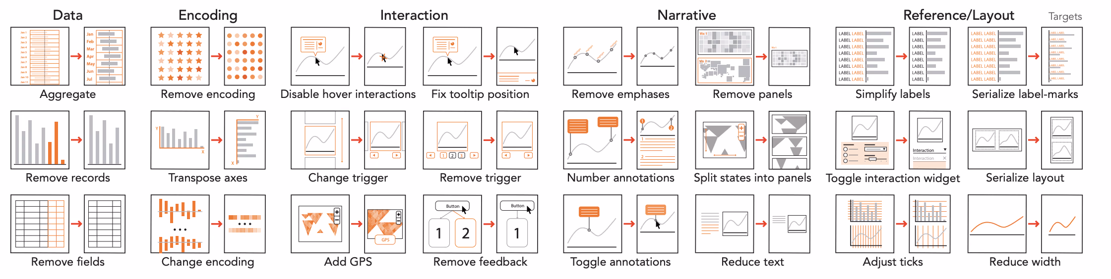
contribute a detailed characterization of responsive visualization strategies in
communication-oriented visualizations, identifying 76 total strategies by
analyzing 378 pairs of large screen (LS) and small screen (SS) visualizations
from online articles and reports. Our analysis distinguishes between the Targets
of responsive visualization, referring to what elements of a design are changed
and Actions representing how targets are changed. We identify key trade-offs
related to authors' need to maintain graphical density, referring to the amount
of information per pixel, while also maintaining the "message" or intended
takeaways for users of a visualization. We discuss implications of our findings
for future visualization tool design to support responsive transformation of
visualization designs, including requirements for automated recommenders for
communication-oriented responsive visualizations.