Visualizing a Million Time Series with the Density Line Chart


Published at
arXiv
2018
Abstract
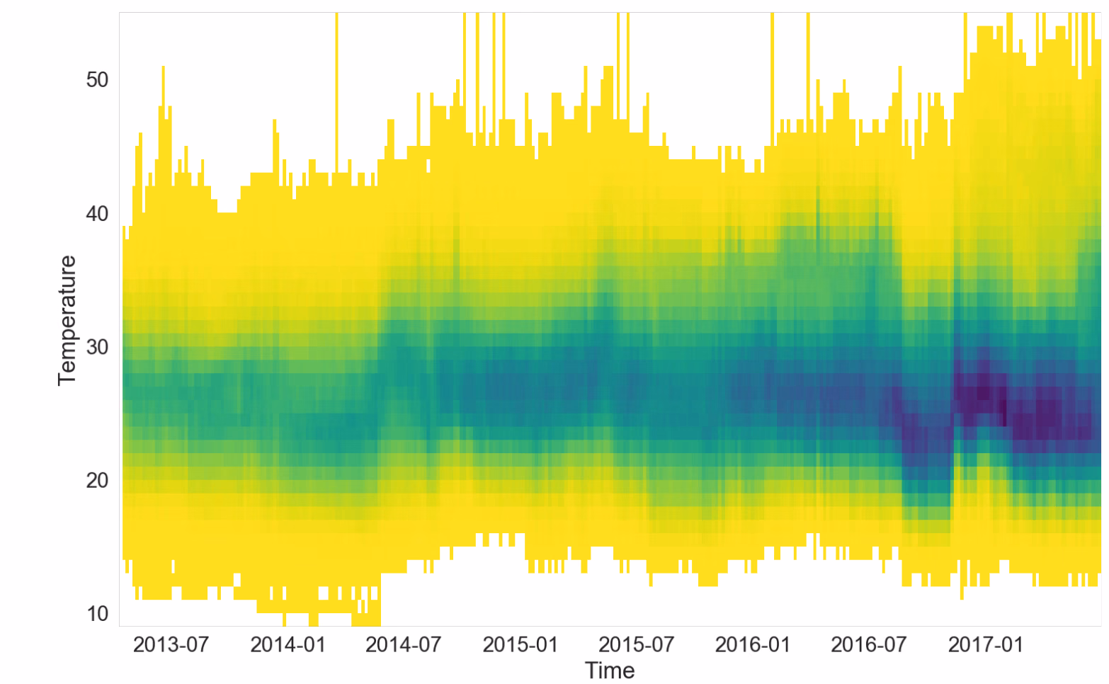
Data analysts often need to work with multiple series of data—conventionally
shown as line charts—at once. Few visual representations allow analysts to view
many lines simultaneously without becoming overwhelming or cluttered. In this
paper, we introduce the DenseLines technique to calculate a discrete density
representation of time series. DenseLines normalizes time series by the arc
length to compute accurate densities. The derived density visualization allows
users both to see the aggregate trends of multiple series and to identify
anomalous extrema.