A3: Interactive Visualization
For this assignment, you will explore the issues involved in implementing an interactive data visualization application in Svelte. You will build an interactive visualization that enables the exploration of an air quality dataset.
Due: Thursday 10/2, Tues 10/09, 11:59 pm ET Submit on Canvas →
Table of Contents
Overview
One goal of this assignment is to gain familiarity implementing interaction techniques for visualizations. For example, the zipdecode and NameVoyager applications shown in class apply the interactive technique of dynamic queries – first explored in the HomeFinder application – to the problem of uncovering patterns in zip codes and baby names. Similarly, treemaps were originally developed to display hierarchical file structure, and were later adapted to the problem of interactively depicting a map of the stock market. We have seen many other examples of interactive visualization techniques in class and in the readings. Interaction and animation techniques have also been very effectively used for explorable explanations, including Kernel Density Estimation (KDE) and machine learning concepts. The goal with this assignment is not only for you to gain hands-on implementation experience, but also for you to think about the effectiveness of the specific techniques for your chosen data domain.
A critical challenge in the second part will be scoping the assignment such that you can complete it. Focus on designing a limited yet compelling application that enables interactive exploration along a few critical dimensions, and then layer on additional complexity. A tightly-focused, well-implemented interactive application is much preferred to a sprawling design that attempts too much!
Peer Review
Critiquing other people’s work and getting feedback on your own work are effective ways to improve your work and learn. On October 2nd, arrange a time to get feedback on your work by each of your two reviewers before the submission is finally due.. Stagger the feedback so you can act on the first before getting feedback from the second person. As a feedback giver, give high-quality feedback, suggest alternatives to think about.
Deliverables
Design, build, and deploy an interactive visualization to explore the dataset. We expect that you use Svelte and D3 for this assignment and that you do not use any other libraries for visualizations. You may use additional libraries for modeling and data transformations. To get started, you may use the code in this template repository.
Part 1
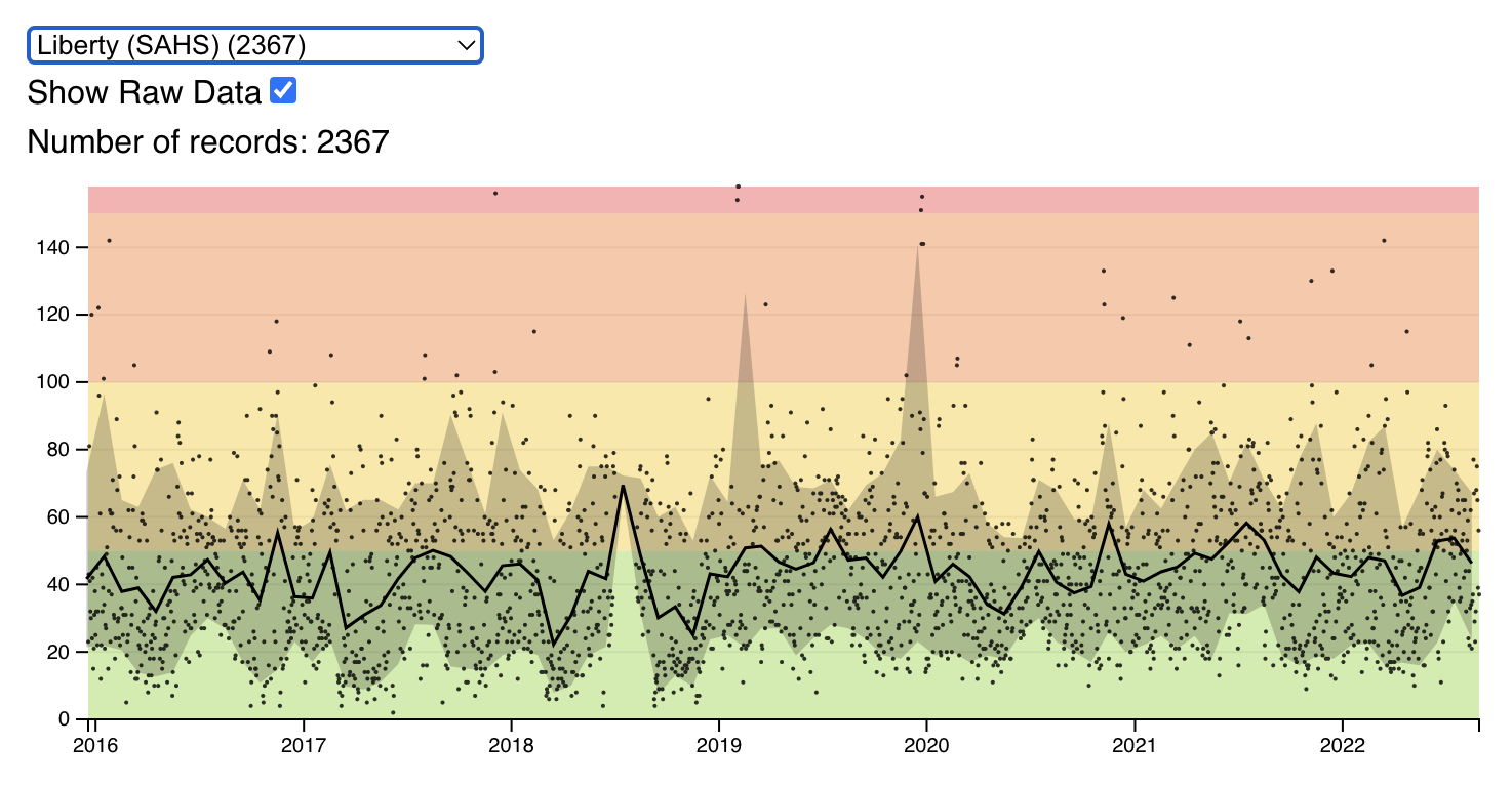
In the first part, create a time-series visualization of the air quality data. The visualization should show the monthly average air quality (AQI) as a line with the inner 80 percentiles (10% to 90%) shown as an area behind the line. Add a dropdown to select the station. If no station is selected, the chart should show the series for all stations. Sort the station names by count. Align the date with the 15th day of the month.
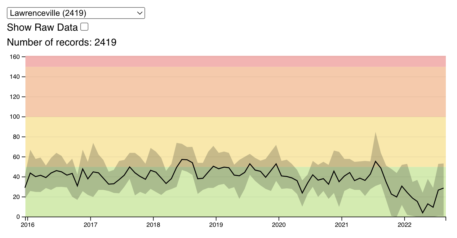
In the background of the chart, show the AQI levels as color using the following scale:

Here is code for the levels you can copy into your project:
[
  {"name":"Good","min":0,"max":50,"color":"#9cd84e"},
  {"name":"Moderate","min":51,"max":100,"color":"#facf39"},
  {"name":"Unhealthy for Sensitive Groups","min":101,"max":150,"color":"#f99049"},
  {"name":"Unhealthy","min":151,"max":200,"color":"#f65e5f"},
  {"name":"Very Unhealthy","min":201,"max":300,"color":"#a070b6"},
  {"name":"Hazardous","min":301,"color":"#a06a7b"}
]
Add a checkbox to toggle showing the raw data as points (time and AQI) on the chart.
Part 2
In this part you are designing your own interactive visualization using the air quality dataset and (optionally) another dataset of your choosing. In order to determine what subset of the data and which interactive options are most promising, we encourage you to perform additional exploratory analysis. What aspects of the data reveal the most interesting discoveries or stories? Do not feel obligated to try to convey everything about the data: focus on a compelling subset. You can reuse any part of your visualization from the first part and use it as part of a compelling multi-view display.
Your visualization must include interactions that enable exploration or storytelling. Possible techniques include panning, zooming, brushing, details-on-demand (e.g., tooltips), dynamic query filters, and selecting different measures to display. You are free to also consider highlights, annotations, or other narrative features intended to draw attention to particular items of interest and provide additional context.
Datasets
You will be using the air quality datasets as CSV files. Here is the list:
- Avalon
- Glassport High Street
- Lawrenceville
- Liberty (SAHS)
- Manchester
- North Braddock
- Parkway East (Near Road)
- USA-Pennsylvania-Pittsburgh
You can link to these datasets or download them and copy them into your project.
Report
Your repository should also include a write-up with the following components:
- A link to the deployed project. Add a link to where the interactive visualization is hosted.
- A rationale for your design decisions. How did you choose your particular visual encodings and interaction techniques? What alternatives did you consider and how did you arrive at your ultimate choices?
- A clear description of the goals of your second visualization. Describe the question that you are enabling a user to answer. The question should be compelling and the solution should be focused on helping users achieve their goals.
- An overview of your development process. Describe how the work was split among the team members. Include a commentary on the development process, including answers to the following questions: Roughly how much time did you spend developing your application (in people-hours)? What aspects took the most time? HOw did you use AI? Provide the prompts you used.
Please submit a link to your GitHub repository on Canvas.
Grading Criteria
Projects that squarely meet the requirements for part 1 will receive a score of 20. Projects that meet the requirements for part 2 will get 10 points. Going beyond the call of duty can net additional points, for example:
- advanced interaction techniques
- novel visualization elements
- effective multi-view coordination
- thoughtful and elegant graphic design
- insightful & engaging exploration experience
- Point deductions will be made when projects suffer from:
Point deductions will be made when projects suffer from:
- errors or broken features
- clearly ineffective visual encodings
- confusing interface design or unhelpful interactions
- lack of exploratory interaction techniques
- incomplete or insufficient write-up
| Component | Pts |
|---|---|
| Effective Data Representations. The employed representations are expressive and effective. They support users in making meaningful and actionable insights. A representation here doesn’t have to be a visualization or chart but could be a table or textual representation. | 3pts |
| Interactivity (Part 1 and 2). The application uses interactivity in a way that enhances the user experience. That means, there are no interactions that enable users to do something that they could have achieved with a static view. Interactivity enables new ways to understand the data or model. Unhelpful interactions will lead to deductions. | 3 pts |
| Design. The application is thoughtfully designed. There are clear descriptions of the features such that a new user can use it without training. The design should prevent misuse of the data or model. Confusing interface design will lead to deductions. | 5 pts |
| Creativity and Novelty. The application uses novel visualization or machine learning elements in a meaningful way. | 3 pts |
| Something extra. An especially insightful or engaging app experience will get extra points. | 2pts |
| Writeup. The writeup should be concise, clear, but complete. An incomplete or insufficient writeup will lead to deductions. The writeup should describe the goals of the project, a rationale for the design decisions, and a brief overview of the development process. | 1pts |
| Correct implementation (Part 1). Correctly implement the requested features for part 1. | 15pts |